


Summer is lively and joyful. Trees are full of green leaves, flowers bloom everywhere, and the sunshine brightly. Everything feels full of life. The summer color palette reflects this energy – filled with bold, bright hues that evoke excitement, joy, and relaxation. The green from leaves, the golden from sunshine, and the pink from hydrangea, these summer colors can fill your home with the spirit of summer.

How to Mix Summer Colors at Home?
One approach, known as the 60:30:10+B/W model, takes the proportions of the golden ratio as its starting point. If you want to mix these summer colors at home, this model can be useful.
The proportions and distribution of the color palette
We can use the same approach in a room by distributing the colors as follows:
- 60 pre cent will be in one or two main colors.
- 30 pre cent will be in subtle and harmonious ( i.e. not contrasting) accent colors, the purpose of which is to lift the main colors.
- 10 pre cent will be spiced up with one or two contrasting colors.
- + B/W stands for one small black or white detail, which is necessary to highlight the chosen colors, helping to bring them out – the finishing touch, you could say.

With this 60:30:10+B/W model, you definitely don’t need to worry about matching colors. Just be bold and try adding more summer color to your home!

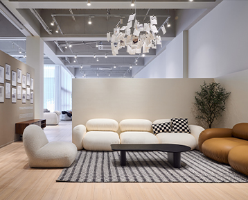
grado user’s home Omelette Sofa Hamburg Lounge Chair
Summer Color Furniture Recommendation
How do you choose the summer colors for your space?
Summer’s main palette is unapologetically bold and attention-grabbing.
Pink -Like a Romantic Summer Sunset
grado’s pink is soft and romantic, like a summer sunset. They feel timeless and calm. When paired with rattan coffee tables or linen curtains, the mix of rough texture and soft color adds fun and style.

9-Layer Sofa Soft Manggis Chair and A Half
This 9-Layer Sofa Soft and Manggis Sofa in pink look like Strawberry Crème Frappuccino. They match beautifully with sage or pistachio green.
Green – A Cool Escape Into Nature
Decorating with green is widely known for its association with nature, giving it a tranquil feel when used in the home. Green takes its inspiration from nature. It’s peaceful and relaxing, and it looks great almost anywhere in the home. This is a very representative summer color.
 Sheff Stool Solar Lounge Chair

9-Layer Sofa Soft Plum Chair
Pairing green with walnut wood bookcase given a Zen vibe. With teak floors, it looks clean and Nordic. Try the Solar Lounge Chair, Plum Chair, 9-Layer Sofa Soft and Sheff Stool. Green helps you cool down and recharge on hot days.
Yellow – Sunshine Captured Indoors
Yellow brings a sunny, warm feel to your home. It doesn’t feel like summer sun – instead, it feels full of life and energy. Choosing for soft shades like buttery yellow, ochre, or cream, which offer vibrance without overwhelming the senses.

Plum Chair Omelette Chair

![]() Owain Recliner Beignet Sofa
Owain Recliner Beignet Sofa
grado’s Beignet Sofa, Omelette Chair, Plum Chair, and Owain Recliner look like drops of honey on light-colored walls. Mix them with a navy blue sofa to create a retro magazine look.
Burgundy – A Glass of Red in the Blues Night
Burgundy blends dark red with hints of purple. It feels rich, mysterious, and elegant – like a summer evening with jazz music playing.
Using burgundy for a room ideas can establish an elegant, opulent feel in homes both classic and modern, as well as enrich a space with an uplifting and unique energy.

Plum Modular Sofa Beignet Sofa

Sheff Stool Owain Rocking Chair
Choose red versions of the Plum Modular Sofa, Shawl Bed, Sheff Stool, and Owain Rocking Chair as statement pieces to show off your bold side.
Summer colors are perfect for creating a space that feels open, fresh, and lively. Bright yellow or burgundy can be used for accent walls or optical center. Blue or green add freshness and coll to any space. These summer colors work best in space for relaxing and entertaining – like the living room, kitchen, or outdoor patios.
To balance the bold summer color choices, add neutral tones like white, beige, or light gray. These calm colors help highlight the bright pieces and make the whole space feel more colorful.

By using the 60:30:10 model, along with a thoughtful warm summer color palette, you can evoke the spirit of summer and create designs that feel as lively and refreshing as the season itself.
